Creating the OWS Protest Note
As published on the blog
Art As Money, December 1, 2011
Dadara has been bugging me for a contribution to this blog for months now. I always mean to sit down and write one, but I have so little time. My adventure from the past couple of weeks, however, makes a good story.
I am an artist who has been specializing in moneyart for the past twelve years. A few weeks ago, I had just started a new work, entitled Liberty Bondage which portrays a fat, rich politician with a pig’s head, leaning over a kneeling Lady Liberty pleading for mercy. It is a comment on the nation’s current frustration with corporate influence in Washington, partly inspired by the Occupy movement. Then, out of the blue, I got an email from an former client of mine, Mark Herpel. He commissioned a set of Community Currency notes from me a couple years ago. He tipped me off to a design contest being held by Matthew Slater, editor of Community Currency Magazine and an influencer in the alt currency world. The competition was looking for an official protest currency for the Occupy Wall Street Movement.
At first I thought that I couldn’t possibly create something worthwhile in the short time period I had. The deadline for the design contest was in only six days! My work usually takes from several weeks to a couple of months per piece. So I thanked Mark, but said I couldn’t do it. Then the more I thought about it, the more I wanted to do it. What if the image becomes a viral hit? Besides, I have spent years creating political satire, and now I have the chance to be a part of a global political phenomenon. Having just started a piece with the same theme only days before, I thought that the timing was more than a coincidence.
The next day, I plunged into it.
FRIDAY, OCTOBER 14
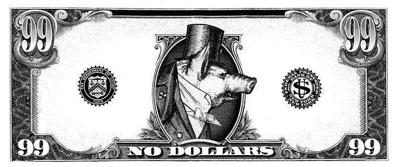
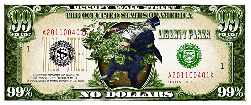
I realized that the only way I could get this finished by the deadline was to re-use many elements from previous works. I grabbed the frame for the front of the note from an unfinished work that I abandoned last year, and I had a generic US $1 oval frame in my library. Since I had already begun work on Liberty Bondage, the head of the pig-politican was a logical choice for the portrait in the oval. I went with a simple number 99 for the corner denominations instead of a 99%. US currency doesn’t have a dollar sign, so this bill shouldn’t have a per-cent symbol in the denominations either. This makes for a more pure and elegant design.
A good start for just a few hours.
SATURDAY, OCTOBER 15
My weekend was unusually clear, so I worked from lunchtime all the way to midnight on Saturday. I combined elements from several pieces, including another financial piece, First Nationalized Bank of America, completed in 2009. The rest of the titles and text I hacked from previous lettering or used a font. You need a certain level of complexity in an image to trigger a response from the viewer that makes them think “Money,” but each element has to have a purpose or meaning.
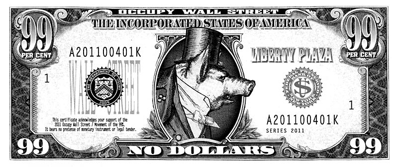
My initial title for the work was The Incorporated States of America, referring to the corporate greed that has taken over and corrupted our legislative process. It worked well with the pig-politician.
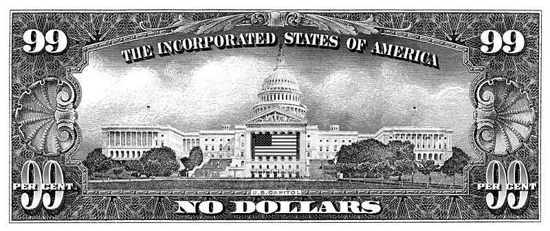
On the back of the note, I combined the US Capitol building with the façade of the NY Stock Exchange. This vignette is enclosed in a frame borrowed from another previous work about the financial state of this nation, The Indebted States of America. I believe that frame originally came from an old Ten Dollar Silver Certificate.
I re-use elements like the frames, rather than go back to the original scan of the asset, because I spend many hours retouching and cleaning them up. Have you ever looked closely at a US currency note scanned at high resolution? It’s pretty ugly. They are routinely over-inked, meaning that all the fine lines have ink bleeding out and clogging things up. The best frames come from obsolete or antique currency, but it can take a few days to clean up the image of a really old note. So with the crushing deadline, I saved at least twelve hours of work just by re-using the frames.
By the end of Saturday night, I had pretty well fleshed out both the front and back of the note.
SUNDAY, OCTOBER 16
After a full day of stuff I had to do, I rushed back to work on the note in the evening. I had a head-smacking realization during the day: the title HAD to be, The Occupied States of America. That was a no-brainer that I had completely missed at first. After sleeping on it, I also realized that the pig-politician was too nasty an image, it was too critical. It reminded me of the blow-up rat that the unions put on front of companies that they are picketing against in New York. I never liked that rat.
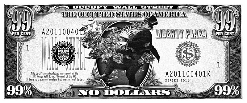
I needed a new image for the oval, and I needed it fast. Then my wife reminded me of the exploding banker from the First Nationalized Bank certificate. It was right in front of me the whole time, and it was the perfect image for the Occupy note! So, I dug up the original vignette that I had made and fit the banker into the oval. Even though the per-cent symbol, or “PER CENT” phrase, would normally break the currency paradigm, it was clearly part of Occupy’s branding, so it needed to be there.
That was it: I knew then that it was done and I could start to color the note the next day.
MONDAY, OCTOBER 17
I first create my work in black and white; color always comes later. For me, it helps to create a pure design that has good formal design structure and balance without the distraction of color. While I may or may not have a color palette in mind at the beginning, it is for me the last step – and it usually goes very quickly. I colorized both the front and back in one evening after work. I like to add color very quickly, because it is so much like actual painting. I feel as if I am literally painting color onto the image with a brush, and I enjoy the spontaneity and freedom of splashing color around.
While experimenting with unusual color themes is fun, this was going to be a protest note, actually a piece of propaganda. It had to not only have mass appeal, but also be a quick read. Since green is the universal color of money in the US, it had to be a green color scheme. I added earth tone colors like sand, brown and red give the color space more depth and warmth.
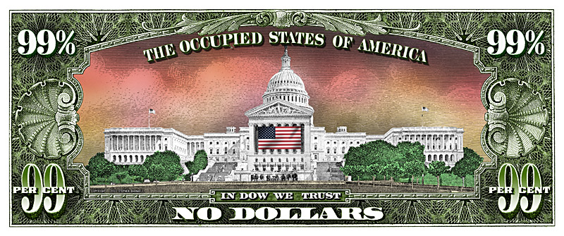
The sky behind the capitol is rich red-orange, representing a sunset. A sunset signals the end of the day. The spirit of the Occupy Movement is hoping for the end of Washington corruption, and a new day of better representational democracy. I also decided to make the US flag full color, because it was necessary to make the NY Stock Market façade stand out.
These are the final images that were submitted to the design competition on Tuesday, October 18, 2011.
THURSDAY, OCTOBER 20
Today I heard from Matthew Slater informing me that I won the design contest. But, as it usually happens, the design brief had changed. He asked if I could incorporate the URL and QR code for the movement's website, www.occupywallst.org. He also rquested that I make the reverse of the note have more blank space for people to sign the note.
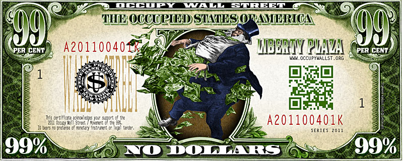
So I removed the Usury Seal and placed the QR code there, it was the logical place for it. But I made the code green to blend in with the color theme of the design. The URL fit nicely above it in a small letter gothic font. That was easy enough, but I needed to make more room for the signatures on the back and the design was perfect the way it was. I didn't want to make the capitol building smaller, it would not look good.
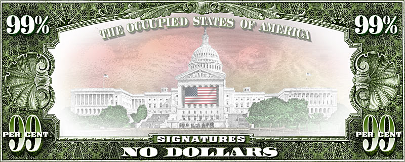
The best thing to do was to keep the original composition, but simply ghost out the entire vignette so people could sign their names right on top of the image. The OCCUPIED STATES title needed to be ghosted too, and I also added a white vignette all around to make it seem even lighter. The IN DOW WE TRUST (referring to the Dow Jones Market) was replaced by a SIGNATURES title. That fulfilled all the client's required changes and he approved it on October 22. These images are the final artwork delivered to the client the next day.
So I'm hoping for the best. Matthew said there was immediate interest for tee shirts and a print run of the protest notes. The next few weeks will tell whether the image will be used in a big way or not. Keep your eyes peeled for this image in the news!
http://blog.artasmoney.com/art-as-money/creating-the-ows-protest-note/#more-398731
|